
Part 5: Data manipulation and plotting
Data exploration with pandas and matplotlib
Now that we’ve covered some of the basics of the Python language, we can explore some basic data analysis using the pandas and matplotlib Python libraries.
If you are using Jupyter Lab through CloudStor or Binder, you should already have the required packages installed.
If you get an error when you try to import the following libraries, you will have to install the relevant package with either pip or conda package managers (depending on how you have installed Python).
This is as simple as running pip install seaborn or conda install seaborn in your terminal.
Import relevant librarires
We begin by importing all the libraries we are likely to use. Don’t worry if you’re not sure what you will need later on - you can always import a library when you need it. However, it’s generally good practice to keep your imports at the start of your document.
import numpy
import pandas
import seaborn
from scipy import stats
import matplotlib.pyplot as plt
Load and examine data
We will now load a .csv data file using pandas. If you don’t already have this file in your working directory, download it from here.
Alternatively, you can run the following bash code in your Jupyter Notebook to automatically download the file into your working directory (the %%bash line is a bit of “cell magic” that tells Jupyter Notebook to run that cell as a bash command):
(Note that this might not work if you are running a local Jupyter notebook on Windows.)
%%bash
wget https://raw.githubusercontent.com/andrewguy/training/master/workshops/Intro_to_Python/data/proteome_data.csv
Loading the data:
gene_data = pandas.read_csv('proteome_data.csv', sep=',')
The gene_data variable is a Pandas DataFrame:
type(gene_data)
pandas.core.frame.DataFrame
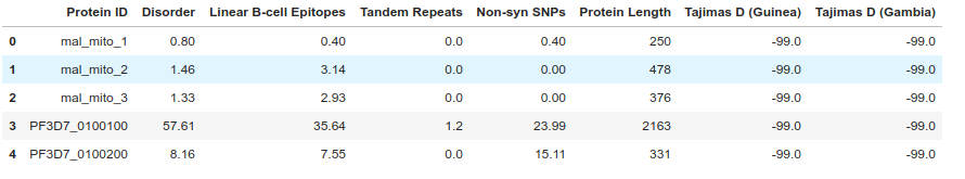
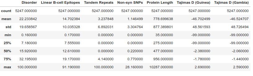
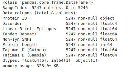
We can use some of the built in DataFrame functions to examine the data. head() shows the first few rows, describe() calculates some basic summary statistics, while info() gives us detailed information on the columns and types of data in each column.
gene_data.head()
gene_data.describe()
gene_data.info()
To access data from a particular column, we can use square brackets [], putting the column name within the brackets (like accessing a dictionary item):
# Get data for a particular column
gene_data['Disorder']
(The data output is rather large, so we are not showing it here)
However, if your column names are valid Python variable names, you can access columns using the . syntax:
(Note that we don’t need to enclose the column name in quotes, unlike when accessing using [].
gene_data.Disorder
We could also use an external library (such as scipy.stats) to get some basic summary statistics for a column. Note that stats was imported from scipy earlier.
stats.describe(gene_data['Disorder'])
DescribeResult(nobs=5247, minmax=(0.16, 100.0), mean=22.23384219554031, variance=386.4592723868353, skewness=1.2867352707379653, kurtosis=1.3764282593472768)
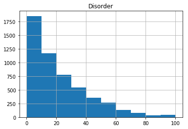
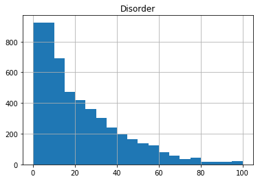
We can also use the default plotting capabilities in pandas to plot a quick histogram of the data:
gene_data.hist(column='Disorder')
array([[<matplotlib.axes._subplots.AxesSubplot object at 0x7f41ee1adef0>]],
dtype=object)
We might want to add more bins to the histogram - we can do this with the bins argument in the hist function:
gene_data.hist(column='Disorder', bins=20)
array([[<matplotlib.axes._subplots.AxesSubplot object at 0x7f41ee061eb8>]], dtype=object)
Using Matplotlib
While we can use the built in plotting functions in Pandas, you will end up needing to use matplotlib to build more complicated plots.
There are two main ways of plotting with matplotlib, which can be very confusing when trying to combine examples from Google!
In brief, these two interfaces are:
- MATLAB style plotting using pyplot
- Object Oriented Interface
We have decided to demonstrate the Object Oriented Interface here, because we feel that this is ultimately more powerful, and arguably much easier to use when constructing complex mutli-panel figures, or working with several figures at once.
With that out of the way, on to some plotting!
We start by creating a Figure object. We need to define a bit of matplotlib terminology here.
Figureobject: A container for all your individual plots.Axesobject: An individual plot. Can be multipleaxeson aFigure.
If we’re considering a mutlipanel figure in a scientific journal, the Figure object would be the overall figure, whereas the Axes would be each individual panel. Don’t confuse the Axes object with an axis on a plot (e.g. x-axis). These are different things!
Creating a scatter plot
The following code creates a figure with a single panel (one Axes object). We are going to set the figure size (in inches, not pixels!). Note the use of a tuple to specify figure size.
We then create a scatter plot on the Axes object, setting x and y values to be Protein Length and level of Disorder respectively:
fig, ax = plt.subplots(figsize=(5, 4))

# Now, using the `ax` object, we draw a scatter plot
ax.scatter(x=gene_data['Protein Length'], y=gene_data['Disorder'])

fig.show()
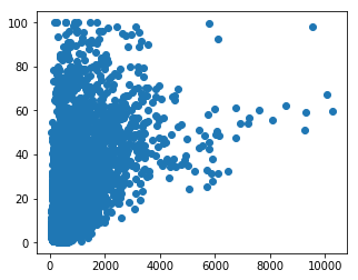
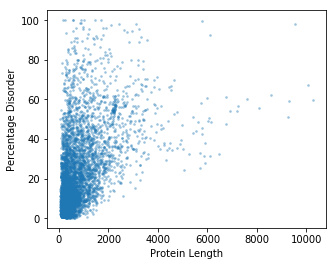
This plot is OK, but could do with some polishing. We can’t really see all of the points (maybe a density estimation plot would be better??), and we need some labels…
# Initialise a figure, with a number of subplots. Each subplot is called an axis - this is what we draw our plot on.
fig, ax = plt.subplots(figsize=(5, 4))

# Now, using the `ax` object, we draw a scatter plot. Set point size to 3.
# We also add a bit of transparency to each pont (alpha = 0.3)
ax.scatter(x=gene_data['Protein Length'], y=gene_data['Disorder'], s=3, alpha=0.3)

ax.set_ylabel("Percentage Disorder")

ax.set_xlabel("Protein Length")

# Show the plot so far...
fig.show()

# Save the figure...
fig.savefig("disorder_vs_length_scatter.png")
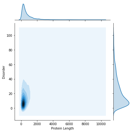
We still have an issue with the number of data points. To deal with this, we can do a kernel density estimation.
We will use the seaborn library to do this. Seaborn provides some very nice plotting functions, with a very simple interface.
kde_plot = seaborn.jointplot(x="Protein Length", y="Disorder", data=gene_data, kind="kde")
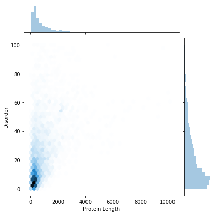
We could also show the data as a hex-bin plot:
hex_plot = seaborn.jointplot(x="Protein Length", y="Disorder", data=gene_data, kind="hex")
If we want to save the figures for later use, we just call the savefig function:
kde_plot.savefig('kde_plot.png')
hex_plot.savefig('hex_plot.png')
It’s also worth saving files as .svg, which is a vector graphics format. This means you can easily make small adjustments in a program such as Adobe Illustrator or Inkscape.
kde_plot.savefig('kde_plot.svg')
hex_plot.savefig('hex_plot.svg')