Approximate time: 30 minutes
Data Visualization with ggplot2
When we are working with large sets of numbers it can be useful to display that information graphically to gain more insight. Visualization deserves an entire course of its own (there is that much to know!). In this lesson we will be plotting with the popular Bioconductor package ggplot2.
More recently, R users have moved away from base graphic options towards ggplot2 since it offers a lot more functionality as compared to the base R plotting functions. The ggplot2 syntax takes some getting used to, but once you get it, you will find it’s extremely powerful and flexible.
For this section, we will be using a modified metadata table, download it from here and save it in the data folder. Next, let’s load it into a new object called new_metadata.
new_metadata <- read.csv("data/new_metadata.csv")

View(new_metadata)
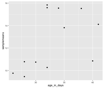
This data frame has 2 additional columns as compared to metadata. The samplemeans column has the mean of the expression in each sample, and the age_in_days column has the corresponding age of the sampled mouse in days. We will start with drawing a simple X-Y scatterplot of samplemeans versus age_in_days from the new_metadata data frame.
Let’s start by loading the ggplot2 library.
library(ggplot2)
The ggplot() function is used to initialize the basic graph structure, then we add to it. The basic idea is that you specify different parts of the plot, and add them together using the + operator. These parts are often referred to as layers.
ggplot2 requires a data frame as input.
Let’s start:
ggplot(new_metadata) # what happens?
You get an blank plot, because you need to specify layers using the + operator.
One type of layer is geometric objects. These are the actual marks we put on a plot. Examples include:
- points (
geom_point,geom_jitterfor scatter plots, dot plots, etc) - lines (
geom_line, for time series, trend lines, etc) - boxplot (
geom_boxplot, for, well, boxplots!)
For a more exhaustive list on all possible geometric objects and when to use them check out Hadley Wickham’s RPubs.
A plot must have at least one geom; there is no upper limit. You can add a geom to a plot using the + operator
ggplot(new_metadata) +
  geom_point() # note what happens here
You will find that even though we have added a layer by specifying geom_point, we get an error. This is because each type of geom usually has a required set of aesthetics to be set. Aesthetic mappings are set with the aes() function and can be set inside geom_point() to be specifically applied to that layer. If we supplied aesthetics within ggplot(), they will be used as defaults for every layer. Examples of aesthetics include:
- position (i.e., on the x and y axes)
- color (“outside” color)
- fill (“inside” color)
- shape (of points)
- linetype
- size
To start, we will add position for the x- and y-axis since geom_point requires the most basic information about a scatterplot, i.e. what you want to plot on the x and y axes. All of the others mentioned above are optional.
ggplot(new_metadata) +
     geom_point(aes(x = age_in_days, y= samplemeans))
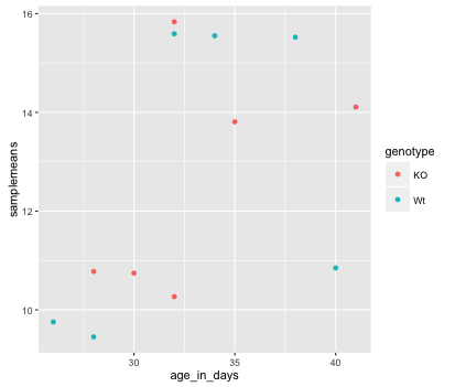
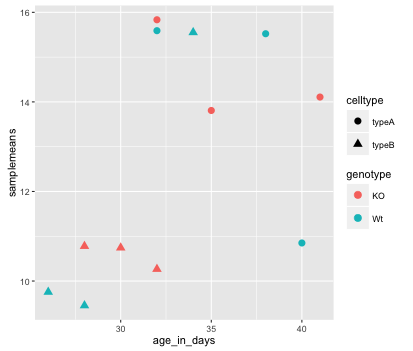
Now that we have the required aesthetics, let’s add some extras like color to the plot. We can color the points on the plot based on genotype, by specifying the column header. You will notice that there are a default set of colors that will be used so we do not have to specify. Also, the legend has been conveniently plotted for us!
ggplot(new_metadata) +
  geom_point(aes(x = age_in_days, y= samplemeans, color = genotype))
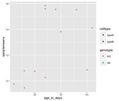
Alternatively, we could color based on celltype by changing it to color =celltype. Let’s try something different and have both celltype and genotype identified on the plot. To do this we can assign the shape aesthetic the column header, so that each celltype is plotted with a different shaped data point. Add in shape = celltype to your aesthetic and see how it changes your plot:
ggplot(new_metadata) +
  geom_point(aes(x = age_in_days, y= samplemeans, color = genotype,
  			shape=celltype))
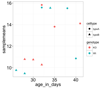
The size of the data points are quite small. We can adjust that within the geom_point() layer, but does not need to be included in aes() since we are specifying how large we want the data points, rather than mapping it to a variable. Add in the size argument by specifying a number for the size of the data point:
ggplot(new_metadata) +
  geom_point(aes(x = age_in_days, y= samplemeans, color = genotype,
  			shape=celltype), size=3.0)
The labels on the x- and y-axis are also quite small and hard to read. To change their size, we need to add an additional theme layer. The ggplot2 theme system handles non-data plot elements such as:
- Axis label aesthetics
- Plot background
- Facet label backround
- Legend appearance
There are built-in themes we can use (i.e. theme_bw()) that mostly change the background/foreground colours, by adding it as additional layer. Or we can adjust specific elements of the current default theme by adding the theme() layer and passing in arguments for the things we wish to change. Or we can use both.
Let’s add a layer theme_bw(). Do the axis labels or the tick labels get any larger by changing themes?
ggplot(new_metadata) +
  geom_point(aes(x = age_in_days, y= samplemeans, color = genotype,
  			shape=celltype), size=3.0) +
  theme_bw()
Not in this case. But we can add arguments using theme() to change it ourselves. Since we are adding this layer on top (i.e later in sequence), any features we change will override what is set in the theme_bw(). Here we’ll increase the size of the axes labels and axes tick labels to be 1.5 times the default size. When modfying the size of text we often use the rel() function. In this way the size we specify is relative to the default (similar to cex for base plotting). We can also provide the number vaue as we did with the data point size, but can be cumbersome if you don’t know what the default font size is to begin with.
ggplot(new_metadata) +
  geom_point(aes(x = age_in_days, y= samplemeans, color = genotype,
  			shape=celltype), size=3.0) +
  theme_bw() +
  theme(axis.text = element_text(size=rel(1.5)),
  		axis.title = element_text(size=rel(1.5)))
NOTE: You can use the
example("geom_point")function here to explore a multitude of different aesthetics and layers that can be added to your plot. As you scroll through the different plots, take note of how the code is modified. You can use this with any of the different geometric object layers available in ggplot2 to learn how you can easily modify your plots!
NOTE: RStudio provide this very useful cheatsheet for plotting using
ggplot2. Different example plots are provided and the associated code (i.e whichgeomorthemeto use in the appropriate situation.)
Exercise
- The current axis label text defaults to what we gave as input to
geom_point(i.e the column headers). We can change this by adding additional layers calledxlab()andylab()for the x- and y-axis, respectively. Add these layers to the current plot such that the x-axis is labeled “Age (days)” and the y-axis is labeled “Mean expression”. - Use the
ggtitlelayer to add a title to your plot. NOTE: Useful code to center your title over your plot can be done usingtheme(plot.title=element_text(hjust=0.5)).
Exporting figures to file
There are two ways in which figures and plots can be output to a file (rather than simply displaying on screen). The first (and easiest) is to export directly from the RStudio ‘Plots’ panel, by clicking on Export when the image is plotted. This will give you the option of png or pdf and selecting the directory to which you wish to save it to. It will also give you options to modify the size and resolution of the output image.
The second option is to use R functions. This would allow you to run an R script from start to finish and automate the process (not requiring human point-and-click actions to save). In R’s terminology, output is directed to a particular output device and that dictates the output format that will be produced. A device must be created or “opened” in order to receive graphical output and, for devices that create a file on disk, the device must also be closed in order to complete the output.
Let’s print our scatterplot to a pdf file format. First you need to initialize a plot using a function which specifies the graphical format you intend on creating i.e.pdf(), png(), tiff() etc. Within the function you will need to specify a name for your image, and the with and height (optional). This will open up the device that you wish to write to:
pdf("figures/scatterplot.pdf")
If you wish to modify the size and resolution of the image you will need to add in the appropriate parameters as arguments to the function when you initialize. Then we plot the image to the device, using the ggplot scatterplot that we just created.
ggplot(new_metadata) +
  geom_point(aes(x = age_in_days, y= samplemeans, color = genotype,
  			shape=celltype), size=rel(3.0))
Finally, close the “device”, or file, using the dev.off() function. There are also bmp, tiff, and jpeg functions, though the jpeg function has proven less stable than the others.
dev.off()
Note 1: You will not be able to open and look at your file using standard methods (Adobe Acrobat or Preview etc.) until you execute the dev.off() function.
Note 2: If you had made any additional plots before closing the device, they will all be stored in the same file; each plot usually gets its own page, unless you specify otherwise.
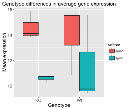
Boxplot
Now that we have all the required information for plotting with ggplot2 let’s try plotting a boxplot. A boxplot provides a graphical view of the distribution of data based on a five number summary. The top and bottom of the box represent the (1) first and (2) third quartiles (25th and 75th percentiles, respectively). The line inside the box represents the (3) median (50th percentile). The whiskers extending above and below the box represent the (4) maximum, and (5) minimum of a data set. The whiskers of the plot reach the minimum and maximum values that are not outliers.
Outliers are determined using the interquartile range (IQR), which is defined as: Q3 - Q1. Any values that exceeds 1.5 x IQR below Q1 or above Q3 are considered outliers and are represented as points above or below the whiskers. These outliers are useful to identify any unexpected observations.
- Use the
geom_boxplot()layer to plot the differences in sample means between the Wt and KO genotypes. - Add a title to your plot.
- Add ‘Genotype’ as your x-axis label and ‘Mean expression’ as your y-axis labels.
- Change the size of your axes labels to 1.5x larger than the default.
- Change the size of your axes text (the labels on the tick marks) to 1.25x larger than the default.
- Change the size of your plot title in the same way that you change the size of the axes text but use
plot.title.
BONUS: Use the fill aesthetic to look at differences in sample means between celltypes within each genotype.
Our final figure should look something like that provided below.
This lesson has been adapted by Andrew Guy, with original lesson material developed by members of the teaching team at the Harvard Chan Bioinformatics Core (HBC). The original material is available here.
These are open access materials distributed under the terms of the Creative Commons Attribution license (CC BY 4.0), which permits unrestricted use, distribution, and reproduction in any medium, provided the original author and source are credited.